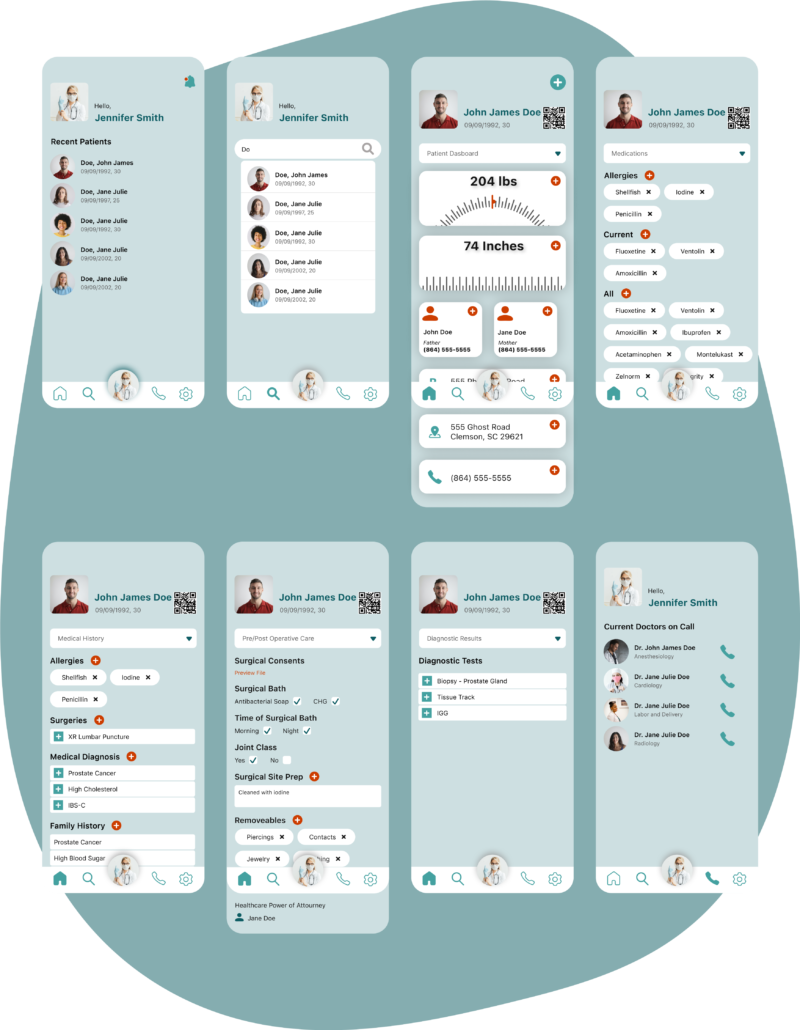
Nexum acts as a bridge between EMR systems. A software that streamlines communication between medical facilities would be beneficial for efficiency, accuracy of information, and consistency across medical care.
Deliverables
- Competitive Analysis
- Personas
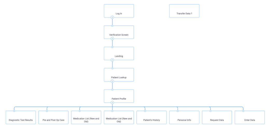
- Sitemap
- Style Guide
Deliverables
- Competitive Analysis
- Personas
- Sitemap
- Style Guide
- Information Architecture
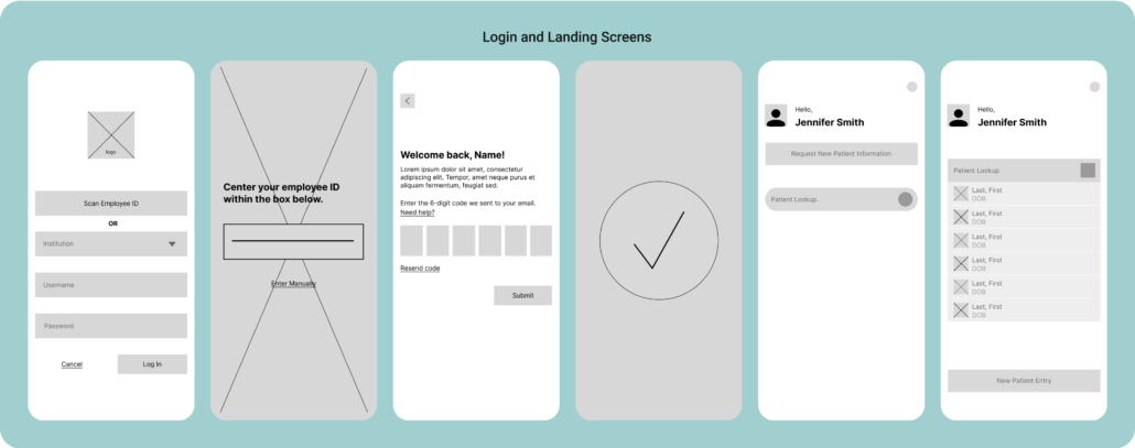
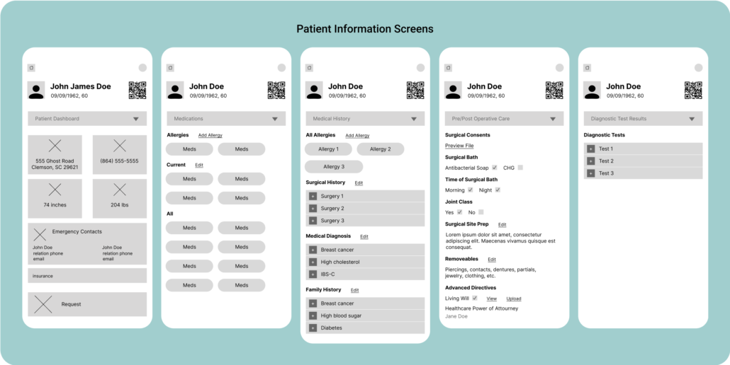
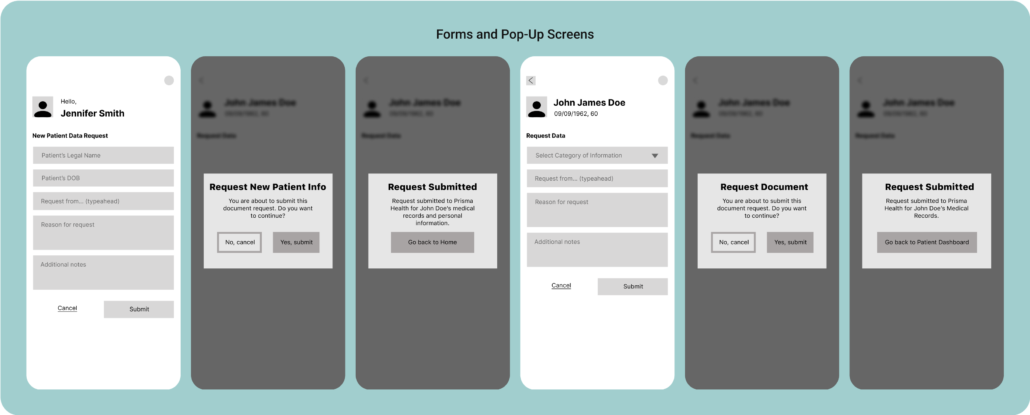
- Wireframes
- Prototype
Tools
Overview
Competitive Analysis
To understand the market and determine what interoperability systems already exist, I executed a competitive analysis of three companies. I discovered the following:
- Carequality is a company that governs data sharing organizations, specifically in the medical field and government. Carequality holds value because they have strong policies and governance in place to ensure clients abide by information protection laws, like HIPPA. Crucial detail: Carequality is not an app, but a framework.
- MyChart is a patient portal that connects to EHR systems. It is a patient-side software, so medical professionals can enter patient data into Epic, an EHR system, and the patient can then see and share the data through MyChart. MyChart holds value because they have a “share code” that gives any provider temporary access to their records.
Crucial detail: The app has to be initiated by a patient since it is a patient-side application. - Epic is an electronic health records (EHR) system where medical professionals can enter patient medical records and information. Epic holds value because it is an all-in-one system for medical providers.
Crucial detail: The software works seamlessly for any facility that uses Epic, but the facilities not on Epic are not integrated and don’t communicate information efficiently.
Personas
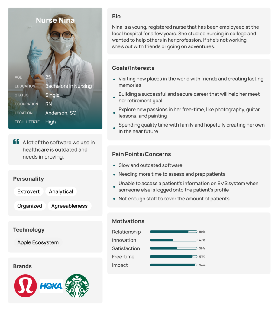
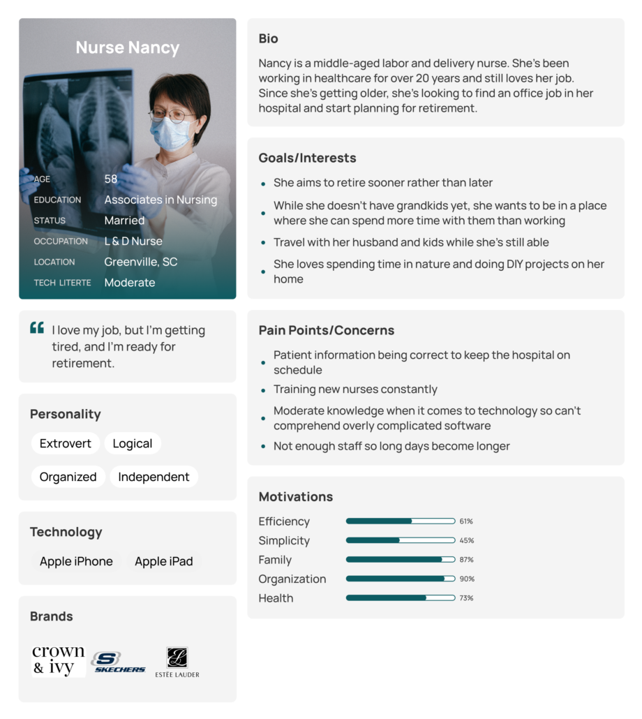
I created two user personas to better empathize with users and indicate which types of users were most likely to use Nexum.
Sitemap
Style Guide
Logo Design
The Nexum colors represent innovation but also professionalism since the app is a medical-based. The “X” is a variation of the “+” used in medicine frequently. “Nexum” comes from the Latin word for connection.
Colors
Below are the main colors used throughout Nexum.
Icons and Typography
Below are the icons and typography used throughout Nexum. I wanted to keep the interface clean since it will be used in an industry that needs simplicity and effectiveness. The fonts are all sans-serif to make the application’s text easier to read while maintaining a clean look.
Wireframes
Wireframes
Hi-fis
Final Prototype
What I Learned
Simple is better. Nexum challenged me to reduce an app to its basic functionalities to create a cleaner and leaner interface. Embracing white space, fewer colors, and plain iconography and typography was how I achieved a simple interface.

