Creatives deserve a platform where their work can speak for itself. Profolio is an app that allows users to create, share, and inspire each other without the limitations of other social media platforms.
Deliverables
Tools
- Discovery Brief
- Competitive Analysis
- Surveys
- Interviews
- Personas
- User Journey Map
- Sitemap
- Sketches
- Wireframes
- User Testing
- Prototype
Deliverables
- Discovery Brief
- Competitive Analysis
- Surveys
- Interviews
- Personas
- User Journey Map
- Sitemap
- Sketches
- Wireframes
- User Testing
- Prototype
Tools
Overview
Research
Key Survey Findings
Key Research Takeaways
Videos are the most common form of content users are consuming. Knowing what type of content was reaching users helped determine what types of features and abilities Profolio needed to have in order to compete with other social media platforms.
Users are consuming artistic content and entertainment content the same amount. Because art was equal with entertainment, this shows there’s an equal amount of space for platforms that cultivate creativity and inspiration along with platforms that entertain and pass time.
Asking users their frequently used apps gave me a starting point to determine what social media platforms users were familiar with and engaged with the most.
Users specified finding the content they wanted to see first such as people they follow or specific users’ stories which supports the statement that users like to customize the content they are consuming.
Personas
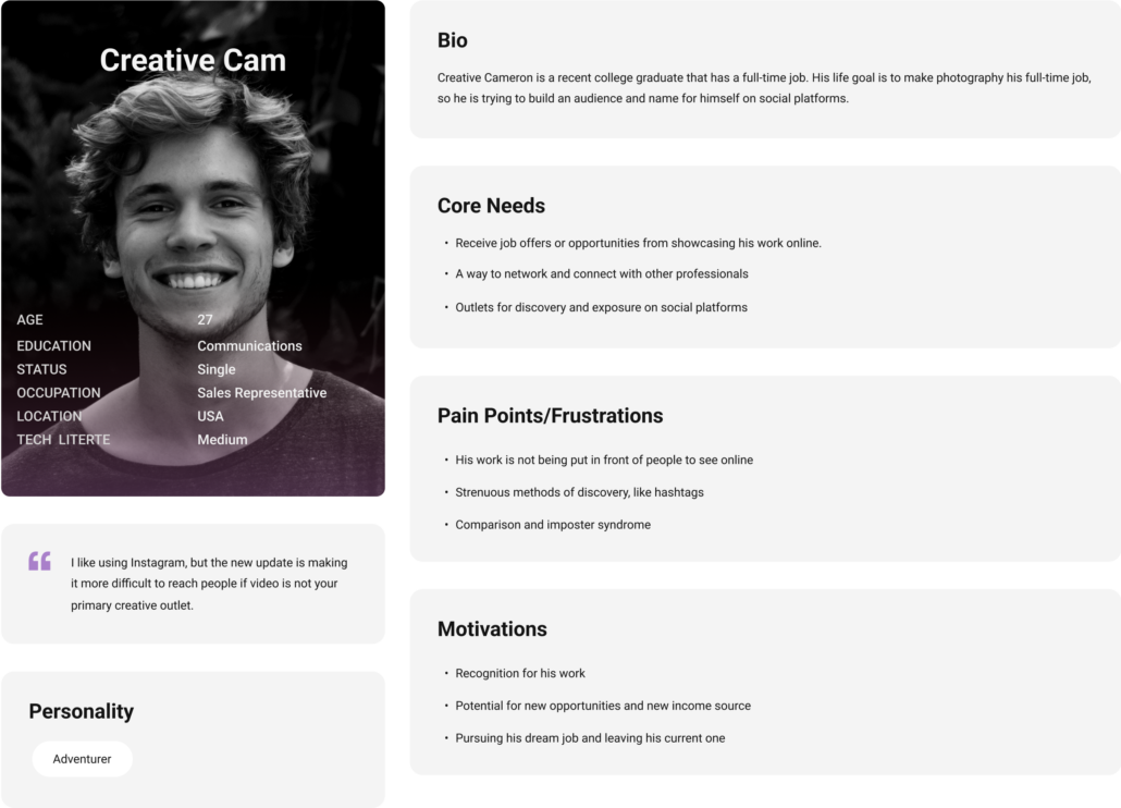
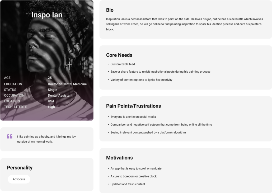
Using the data I gathered from research, I created two user personas to better empathize with users and indicate which types of users were most likely to use Profolio. Creative Cam is the primary user for the app while Inspo Ian is the least common.
User Journey Map
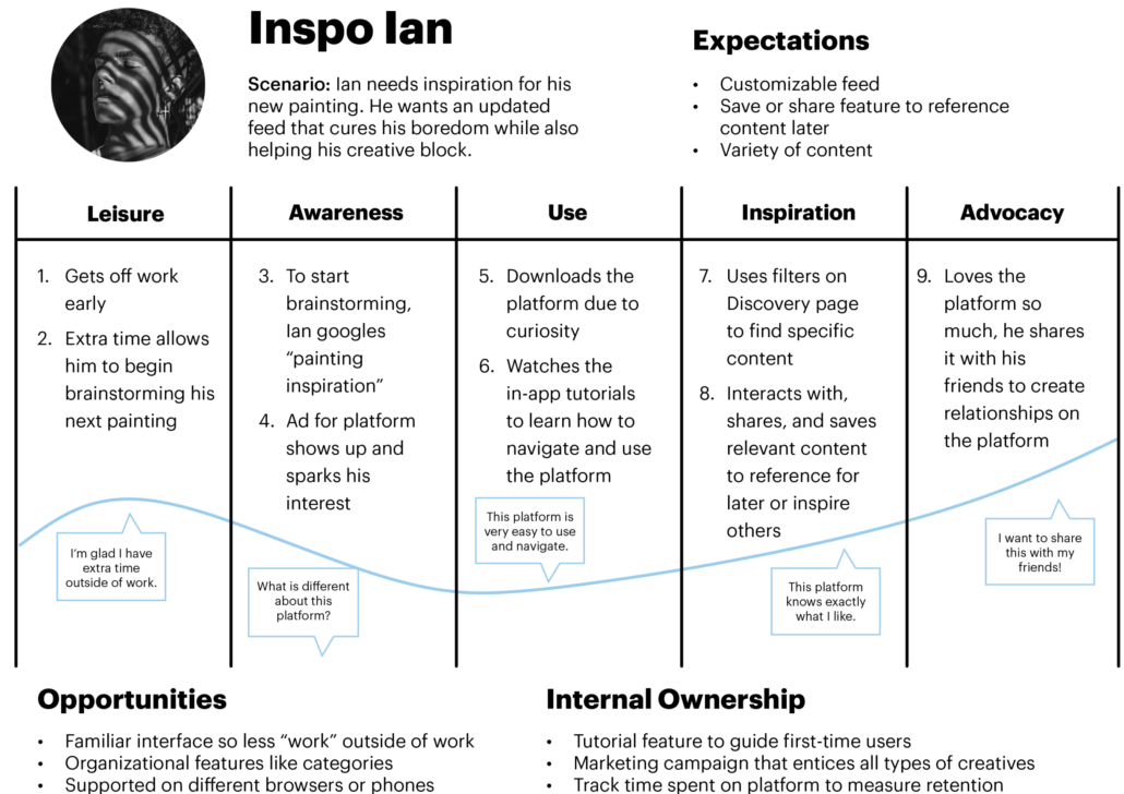
Making a user journey map gave me a better perspective of a user’s experience including positive attitudes or frustrations while using the app. I used Inspo Ian for the user journey map because I wanted to make sure I thought about the least popular expectations for Profolio rather than the user expectations that aligned directly with the app’s purpose.
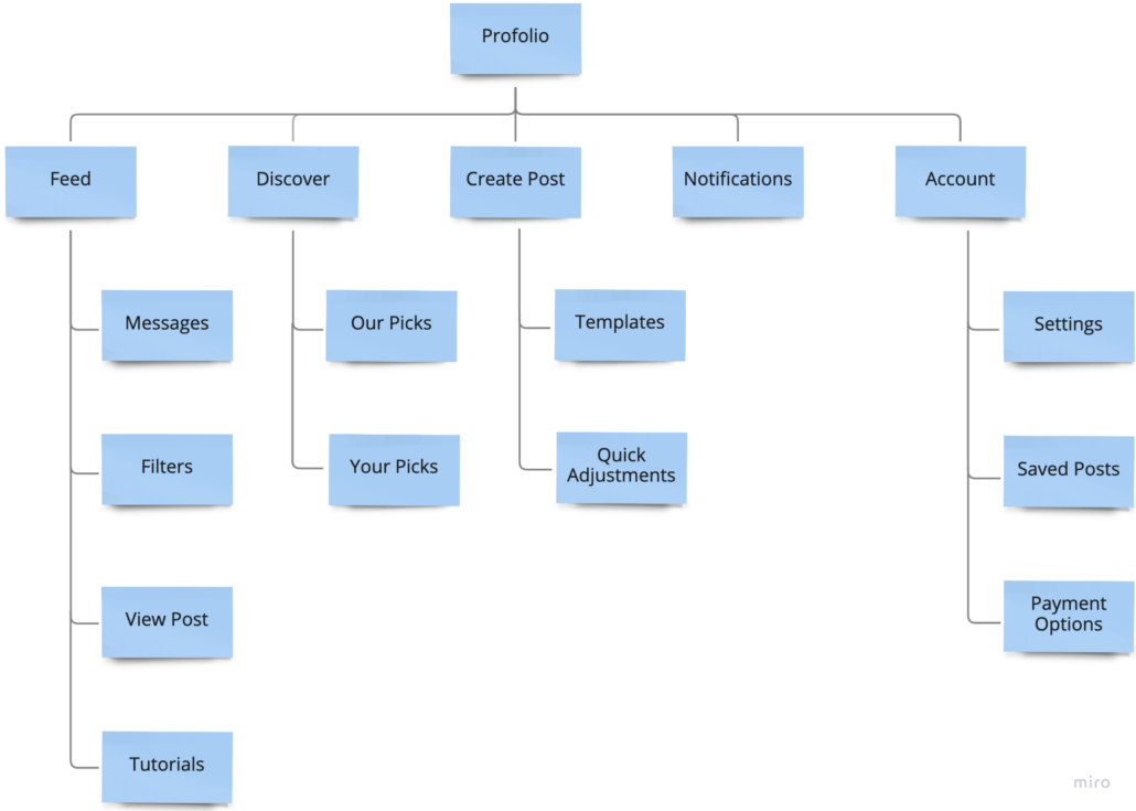
Sitemap
Style Guide
Logo Design
Colors
Below are the main colors used throughout the Profolio app.
Icons and Typography
I designed the icons to be familiar to users, so they could spend more time using the app instead of trying to decipher different icon meanings. I also made a dark mode version of the icons since that’s a trend in current UI design.
Wireframes
Sketches
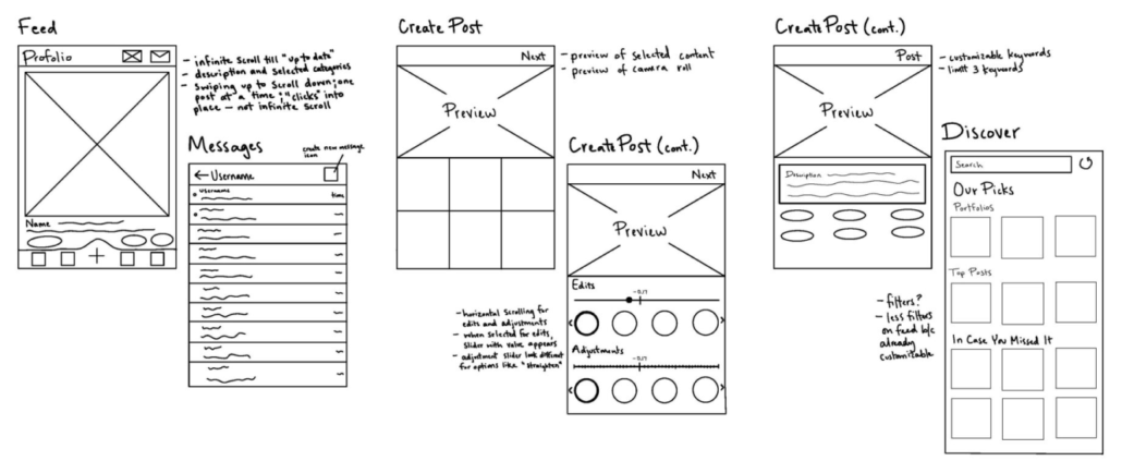
I first drew sketches to decide the initial look and layout of Profolio.
Wireframes
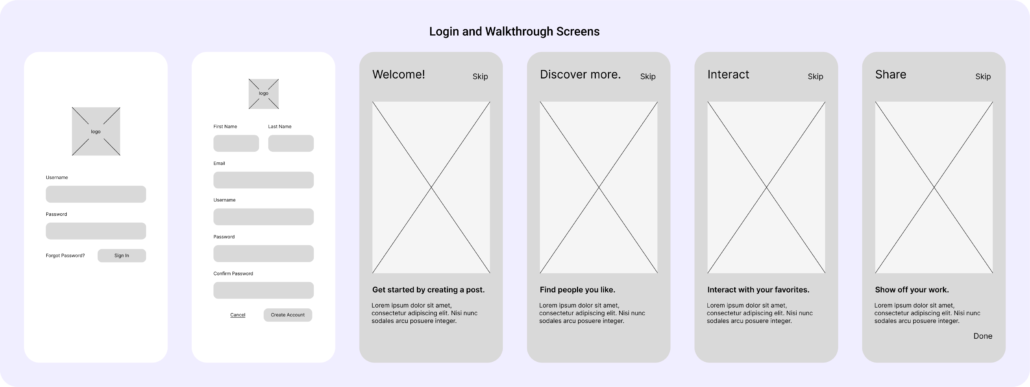
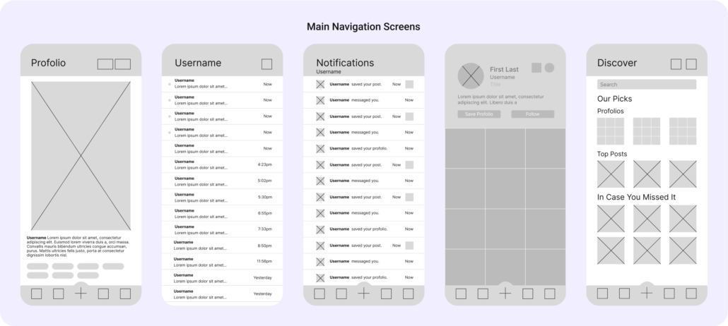
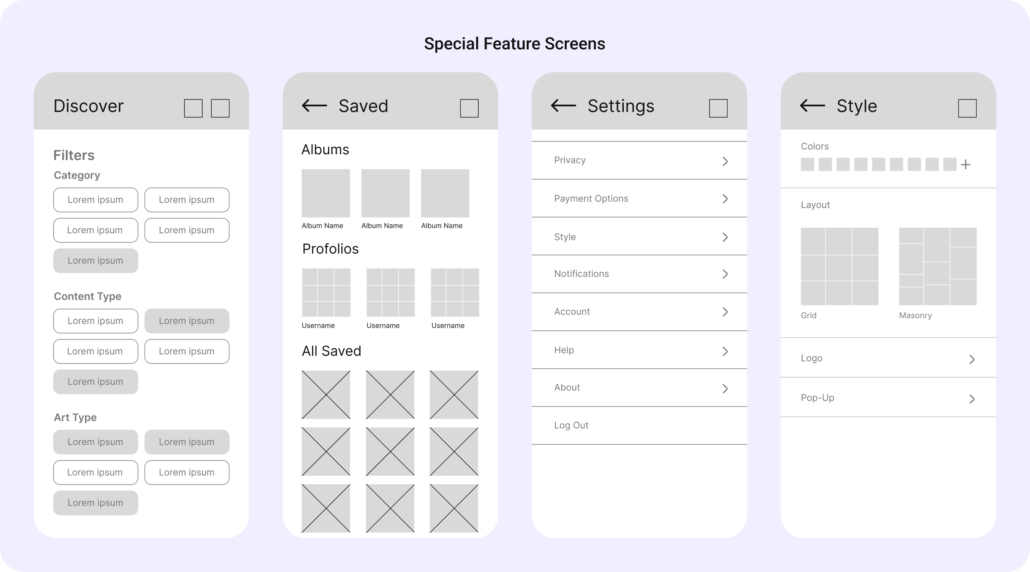
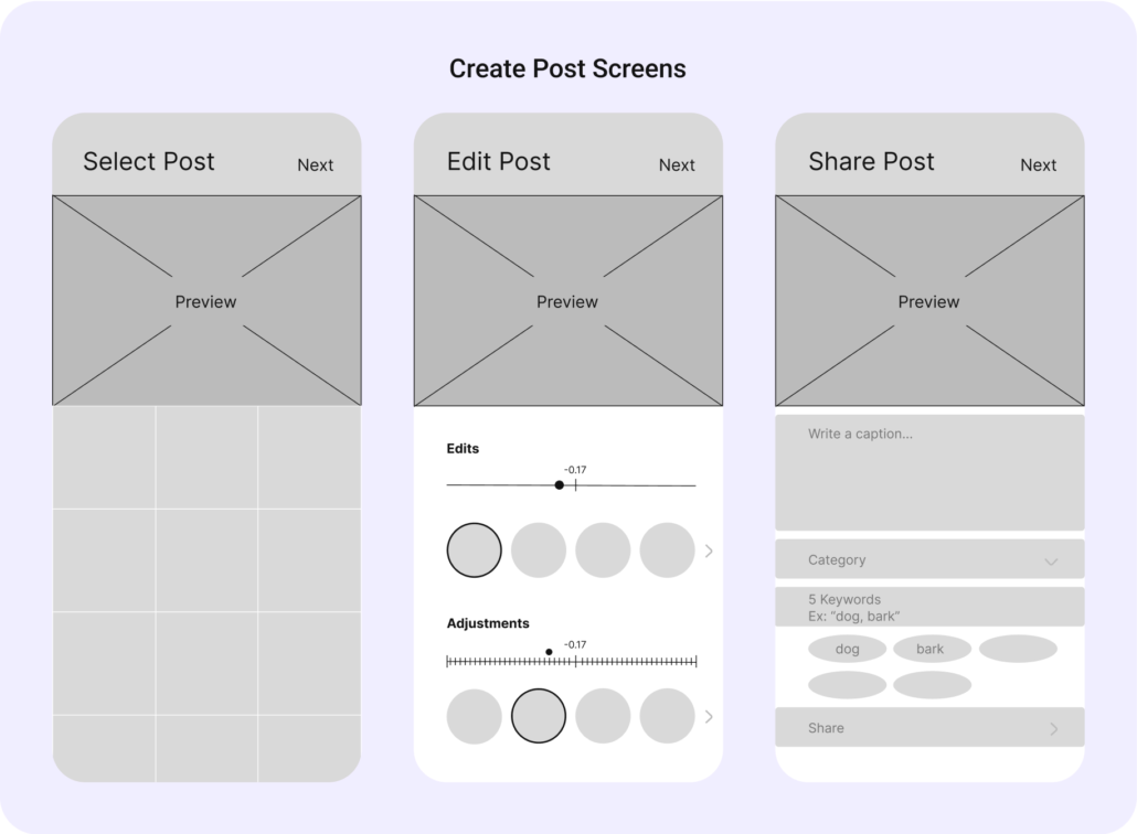
After the sketches, I started solidifying the design of the app with lo-fis of each screen. During this phase, I changed some features to function better in a mobile format. For example, the tutorials changed from pop-ups to full-screens with a swiping interaction to advance to the next screen. Also, the discover filters went from checkboxes to large buttons, so they were easier to click on a mobile device.
Hi-fis
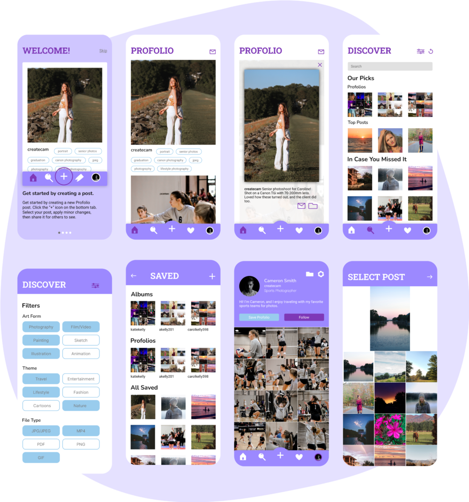
Once the lo-fis were created, I then designed hi-fis of each screen within the app. After seeing the design come to life, I decided to change the layout of the Feed page. Instead of having a layout similar to Instagram, I only included the cropped version of a post and its keywords. Keywords are crucial to the discovery aspect of the UI design, so I wanted them to be the first buttons users could click if they wanted to see similar posts. Hiding captions until the media is clicked allows users to get more information on the post, but only if they choose to do so.
User Testing
After designs were decided, I moved onto user testing where I analyzed the 3 main flows: creating a post, customizing a profile, and saving a post. The results from testing were promising because the user completed each flow without any issues. Suggestions to improve the flow included designing a new screen to alter profile customization (instead of accessing it through settings) and changing a few feature labels to be clearer.
Final Prototype
If I Had More Time
If I had more time to work on Profolio, I would make some changes that include: performing more user testing (specifically for the discover page), incorporating unique interactions for this app to make it feel less stagnant, and also thinking of ways users can interact with their friends rather than just saving a post or messaging them.
What I Learned
My main takeaway from creating Profolio was learning how to empathize with the user first. Instead of drawing from solely my personal experience for a problem, taking a step back and analyzing all points of view creates a better experience and final result in the end.

